Diagram Your Service

I love packets and tracing issues at a micro level. However, like I stated in Preparing for the Capture you need to know where to capture before you can dig into the bits an bytes. In order to know where to capture you must understand your service/app/network. The best way to do that is to diagram your service.
The Diagram
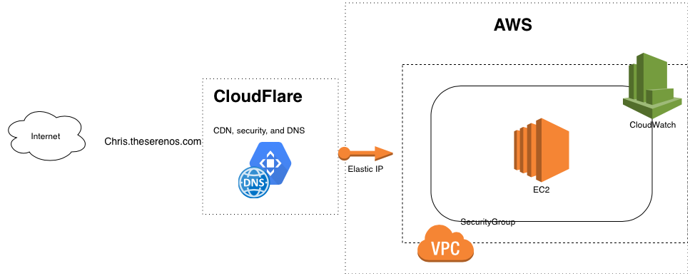
The featured image on the post and the same one included below is a high level example of an architecture diagram of this blog. I use CloudFlare and AWS services currently to host it. The diagram shows this flow along with the purpose of these services and a little more detail outlining the layout of AWS. In a more detailed and private diagram I could also include breakouts showing the actual services running such as WordPress, Apache, and MariaDB. I could also include external services that provide MFA, email, monitoring, and notifications.
Created with draw.io
The Purpose
An architecture diagram does more than highlight good capture points. In fact there are numerous benefits. Here are just a few:
- Forces a better understanding of the service by the diagram creator
- Creates a point-in-time reference of the architecture
- Reveals dependencies
- Makes troubleshooting and recovery time quicker (the ultimate goal)
It seems many, if not most, people have an aversion to documentation and diagramming. I have found, however, that the long-term benefits outweigh the extra few minutes it takes to create. Why not get started today and diagram your home network or an app you wrote? It might surprise you.
 Chris Sereno